IELTS Bar Chart Questions
Cambridge IELTS Bar Chart Questions
A bar chart is common in academic IELTS writing task 1. The bar chart is also known as a bar graph, in which information is represented in rectangular bars (vertical/horizontal). Mostly, the bar graph shows variation in time. If there is a variation in time, you will need to show the change in time in your sentences.
Instructions for all tasks:
- You should spend 20 minutes on this task.
- You should write at least 150 words.
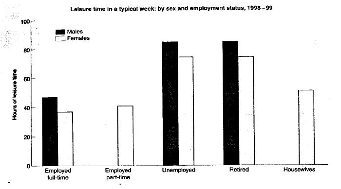
Leisure time enjoyed by men and women
The chart below shows the amount of leisure time enjoyed by men and women of different employment status. Write a report for a university lecturer describing the information shown below.
Model Answer
Australian men and women in different age groups who did regular physical activity
The bar chart below shows the percentage of Australian men and women in different age groups who did regular physical activity in 2010. Summarize the information by selecting and reporting the main features, and make comparisons where relevant.

How frequently people in the USA ate in fast food restaurants
The chart below shows how frequently people in the USA ate in fast food restaurants between 2003 and 2013. Summarise the information by selecting and reporting the main features, and make comparisons where relevant.

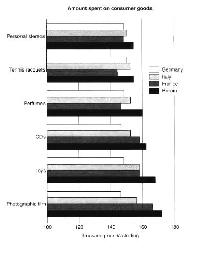
Amount spent on six consumer goods in four European countries
The chart below shows the amount spent on six consumer goods in four European countries. Write a report for a university lecturer describing the information shown below.
Model Answer
Levels of participation in education and science in developing and industrialised countries
The charts below show the levels of participation in education and science in developing and industrialised countries in 1980 and 1990. Write a report for a university lecturer describing the information shown below.

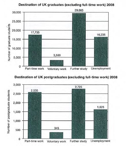
UK graduate and postgraduate students who did not go into full-time work
The charts below show UK graduate and postgraduate students who did not go into full-time work after leaving college in 2008. Summarise the information by selecting and reporting the main features, and make comparisons where relevant.
Number of minutes of telephone calls in the UK
The chart below shows the total number of minutes (in billions) of telephone calls in the UK, divided into three categories, from 1995-2002. Summarise the information by selecting and reporting the main features, and make comparisons where relevant.

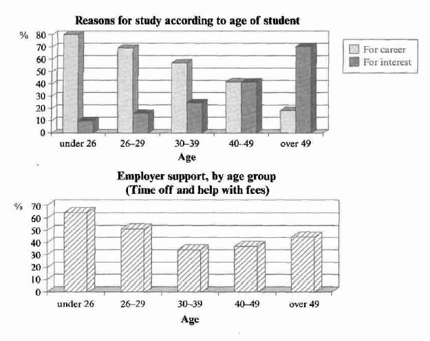
Reasons for study among students of different age groups
The charts below show the main reasons for study among students of different age groups and the amount of support they received from employers. Summarise the information by selecting and reporting the main features, and make comparisons where relevant.
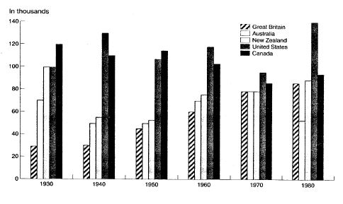
Figures for imprisonment in five countries
The chart below shows the figures for imprisonment in five countries between 1930 and 1980. Write a report for a university lecturer describing the information shown below.
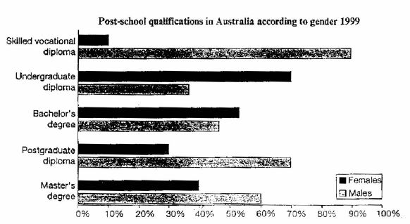
Different levels of post-school qualifications in Australia
The chart below shows the different levels of post-school qualifications in Australia and the proportion of men and women who held them in 1999. Summarise the information by selecting and reporting the main features, and make comparisons where relevant.
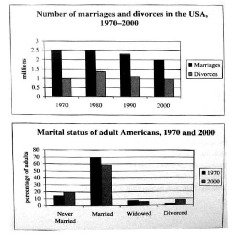
USA marriage and divorce rates
The charts below give information about USA marriage and divorce rates between 1970 and 2000, and the marital status of adult Americans in two of the years. Summarise the information by selecting and reporting the main features, and make comparisons where relevant.
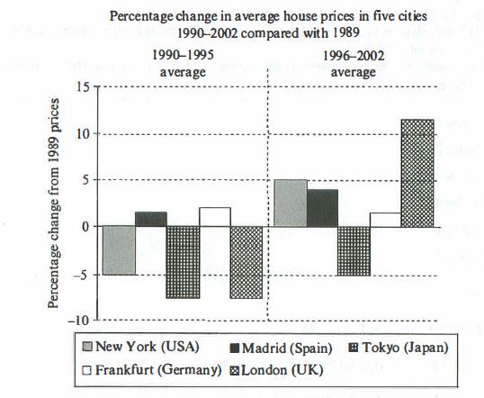
Changes in average house prices in five different cities
The chart below shows information about changes in average house prices in five different cities between 1990 and 2002 compared with the average house prices in 1989. Summarise the information by selecting and reporting the main features, and make comparisons where relevant.
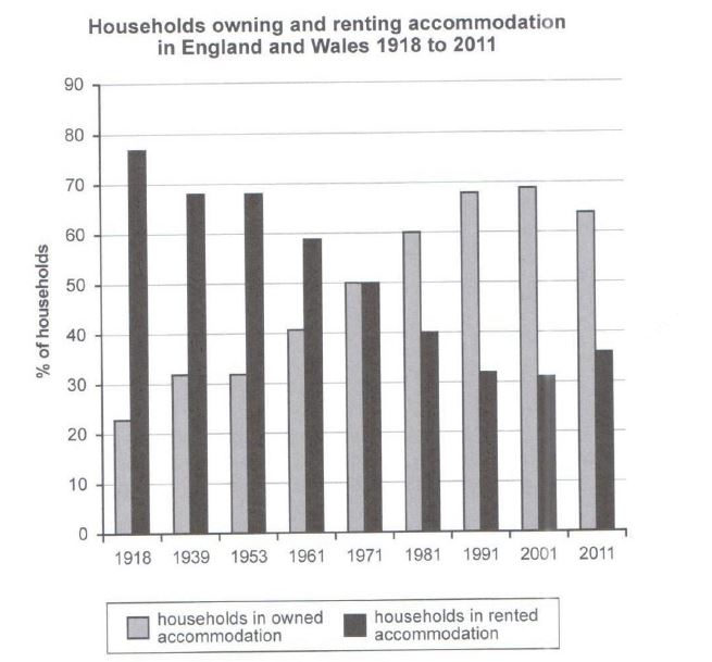
Percentage of households in owned and rented accommodation in England and Wales
The chart below shows the percentage of households in owned and rented accommodation in England and Wales between 1918 and 2011. Summarise the information by selecting and reporting the main features, and make comparisons where relevant.
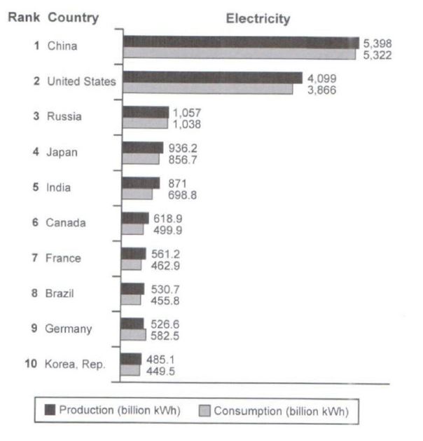
Top ten countries for the production and consumption of electricity
The bar chart below shows the top ten countries for the production and consumption of electricity in 2014. Summarise the information by selecting and reporting the main features, and make comparisons where relevant.