IELTS Combination Questions
Cambridge IELTS Combination Questions
In IELTS combination questions, information is given in two different illustrations. For example, information is given in a bar chart and a table.
The best method to solve these types of questions is understanding the need of giving information in separate illustrations. Once you understand this, try to analyze and group similar information. Remember to use the correct language for different illustrations.
Instructions for all tasks:
- You should spend 20 minutes on this task.
- You should write at least 150 words.
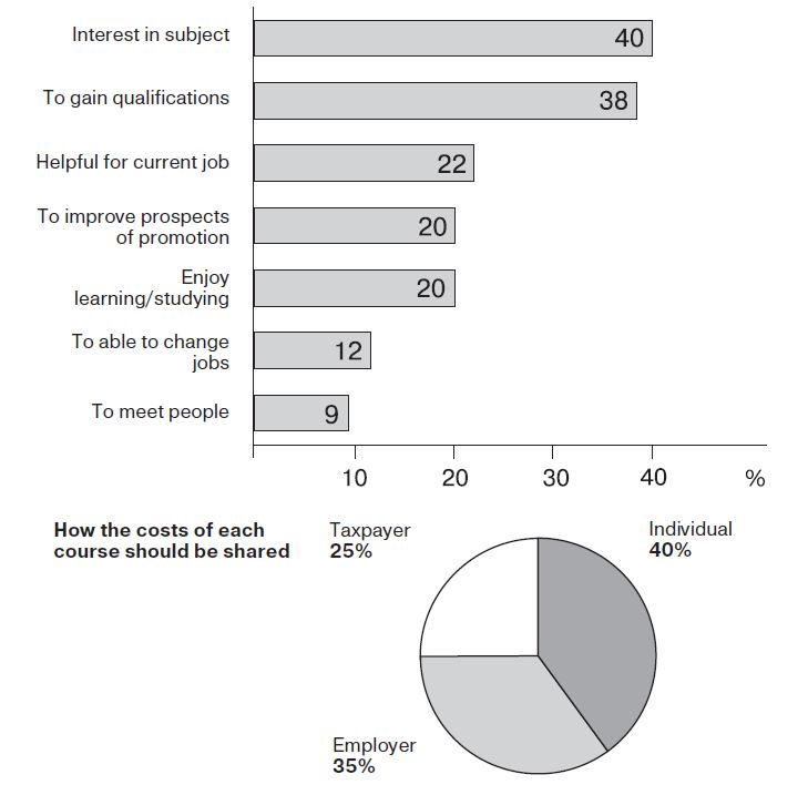
Results of a survey of adult education
The charts below show the results of a survey of adult education. The first chart shows the reasons why adults decide to study. The pie chart shows how people think the costs of adult education should be shared. Write a report for a university lecturer, describing the information shown below.
Amount of money per week spent on fast foods in Britain
The chart below shows the amount of money per week spent on fast foods in Britain. The graph shows the trends in consumption of fast foods. Write a report for a university lecturer describing the information shown below.

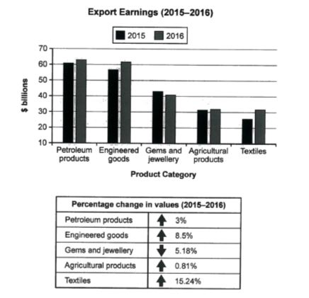
Country's exports in various categories
The chart below shows the value of one country’s exports in various categories during 2015 and 2016. The table shows the percentage change in each category of exports in 2016 compared with 2015. Summarise the information by selecting and reporting the main features, and make comparisons where relevant.
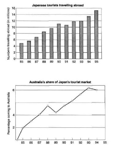
Japanese tourists travelling abroad
The charts below show the number of Japanese tourists travelling abroad between 1985 and 1995 and Australia’s share of the Japanese tourist market. Write a report for a university lecturer describing the information shown below.
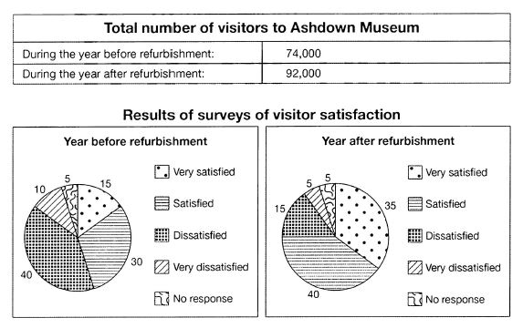
Visitors to Ashdown Museum
The table below shows the numbers of visitors to Ashdown Museum during the year before and the year after it was refurbished. The charts show the result of surveys asking visitors how satisfied they were with their visit, during the same two periods. Summarise the information by selecting and reporting the main features, and make comparisons where relevant.
Demand for electricity in England during typical days in winter and summer
The graph below shows the demand for electricity in England during typical days in winter and summer. The pie chart shows how electricity is used in an average English home. Summarise the information by selecting and reporting the main features, and make comparisons where relevant.

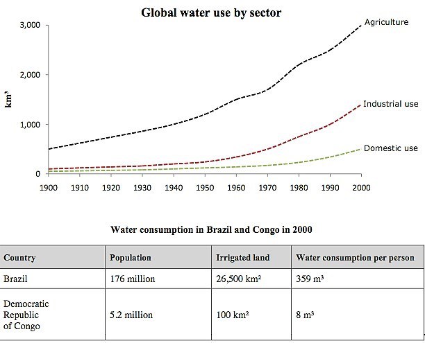
Water use worldwide and water consumption
The graph and table below give information about water use worldwide and water consumption in two different countries. Summarise the information by selecting and reporting the main features, and make comparisons where relevant.
Main reasons why agricultural land becomes less productive
The pie chart below shows the main reasons why agricultural land becomes less productive. The table shows how these causes affected three regions of the world during the 1990s. Summarise the information by selecting and reporting the main features, and make comparisons where relevant.

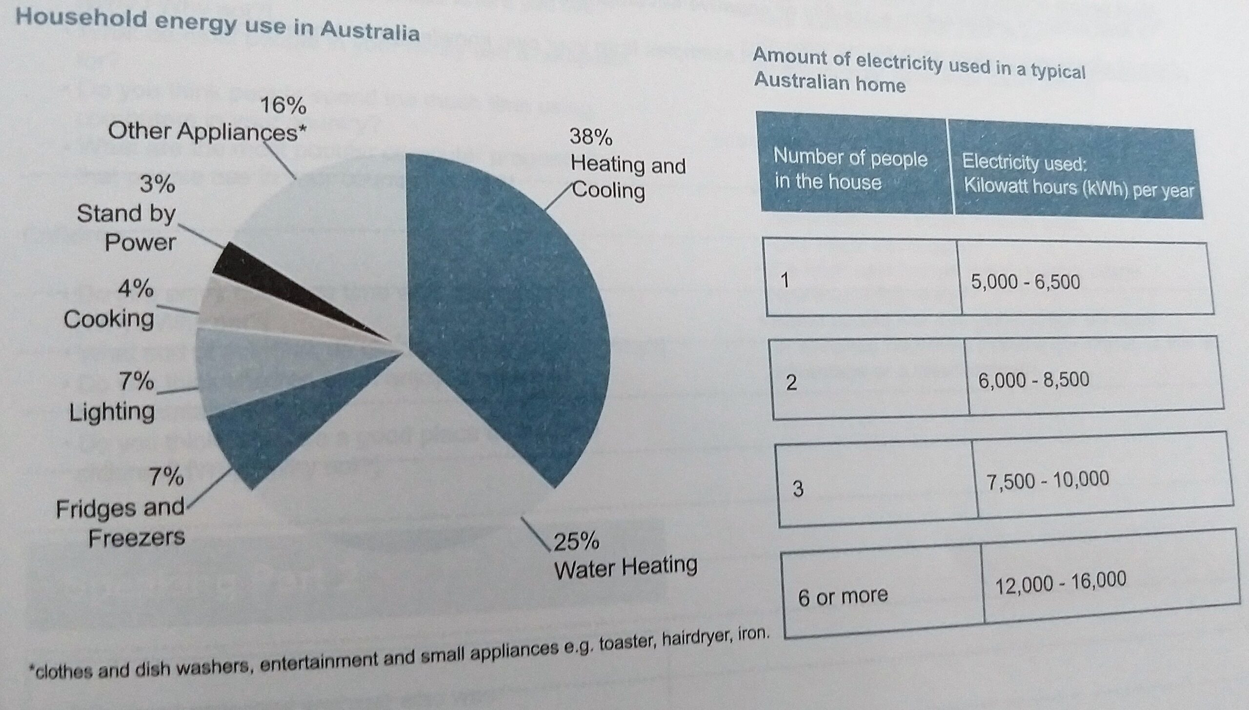
Energy in Australian Household
The pie chart below shows where energy is used in a typical Australian household, and the table shows the amount of electricity used according to the number of occupants. Summarise the information by selecting and reporting the main features, and make comparisons where relevant. [source: IELTS Essential Guide British Council]