
IELTS Pie Chart Questions
A pie chart represents data in a circular graph. While writing about an IELTS pie chart, you should make a comparison between items and group them based on similarities and differences.
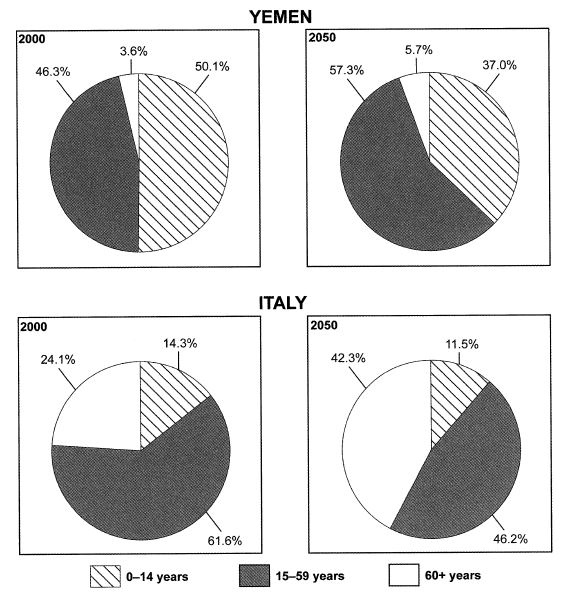
Ages of the populations of Yemen and Italy
The chart below gives information on the ages of the populations of Yemen and Italy in 2000 and projections for 2050. Summarise the information by selecting and reporting the main features, and make comparisons where relevant.
Average percentages in typical meals of three types of nutrients
The charts below show the average percentages in typical meals of three types of nutrients, all of which may be unhealthy if eaten too much. Summarize the information by selecting and reporting the main features, and make comparisons where relevant.

Water used for different purposes in six areas
The charts below show the percentage of water used for different purposes in six areas of the world. Summarise the information by selecting and reporting the main features, and make comparisons where relevant.

British students at one university in England who were able to speak other languages
The charts below show the proportions of British students at one university in England who were able to speak other languages in addition to English, in 2000 and 2010. Summarise the information by selecting and reporting the main features, and make comparisons where relevant.

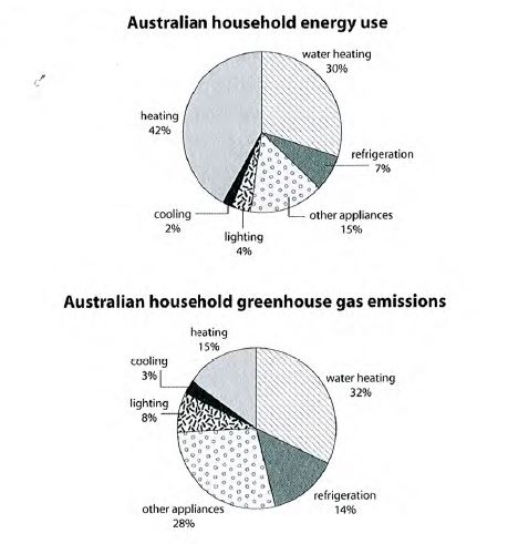
Energy is used in an average Australian household
The first chart below shows how energy is used in an average Australian household. The second chart shows the greenhouse gas emissions which result from this energy used. Summarise the information by selecting and reporting the main features, and make comparisons where relevant.
Electricity production by fuel source in Australia and France
The pie charts below show units of electricity production by fuel source in Australia and France in 1980 and 2000. Summarise the information by selecting and reporting the main features, and make comparisons where relevant.

Changes in annual spending by a particular UK school
The three pie charts below show the changes in annual spending by a particular UK school in 1981, 1991 and 2001. Summarise the information by selecting and reporting the main features, and make comparisons where relevant.
