
Cambridge IELTS Academic 18 Writing Task 1 Model Answers
Test - 1
The graph gives information about the percentage of the population in four Asian countries living in cities from 1970 to 2020, with predictions for 2030 and 2040.
Summarise the information by selecting and reporting the main features, and make comparisons where relevant.

What proportion of the total population in the Philippines, Malaysia, Thailand, and Indonesia has lived in urban areas from 1970 to 2020, and what the trend will be in 2030 and 2040, is shown in a line graph.
Overall, all four countries will have a higher proportion of people living in cities compared to the past. The percentage of the total population living in cities in Indonesia was the lowest among the four countries, but in the future, it will surpass that of the Philippines and Thailand. Malaysia will have the highest proportion of its total population residing in cities in the future.
In 1970, less than 20 percent of the total population in Indonesia and Thailand lived in cities. This percentage gradually increased in both countries, reaching around 30 percent by 2000. After that, the growth in the urban population was faster in Indonesia than in Thailand. By 2010, the urban population in Indonesia had reached a proportion similar to that of the Philippines, at more than 40 percent. However, Indonesia’s urban population will rise further, reaching the second-highest spot in 2040, with around 60 percent of people living in cities. In contrast, Thailand’s urban population will remain below 50 percent in 2040.
Approximately 30% of the total population in Malaysia and the Philippines resided in cities in 1970. The urban population in both countries followed a similar pattern until 1990. However, after 1990, Malaysia’s urban population began to grow rapidly, surpassing that of the Philippines, which stabilized at around 50%. This upward trend in Malaysia is projected to continue, with its urban population expected to exceed 80% by 2040, the highest among the four countries considered. In contrast, the Philippines’ urban population will remain steady at approximately 50% in 2040.
Test - 2
The chart shows the number of households in the US by their annual income in 2007, 2011 and 2015.
Summarise the information by selecting and reporting the main features, and make comparisons where relevant.
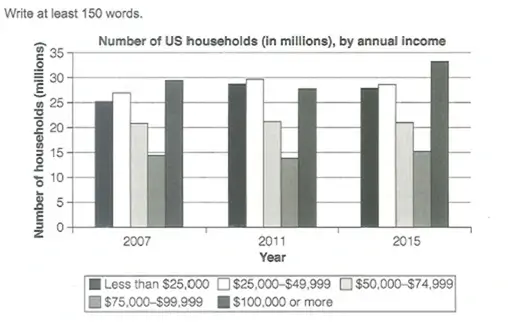
The number of households in the United States according to their annual earnings in 2007, 2011, and 2015 is shown in a vertical bar chart.
Overall, households earning $75,000–$99,999 were the lowest among all income groups in all three years. The number of households earning between $50,000 and $74,999 remained almost unchanged across the three years. In 2015, the highest number of households earned $100,000 or more.
In 2007, 25 million households earned less than $25,000, and this number increased to around 30 million in 2011 before declining in 2015. Households earning between $50,000 and $74,000 remained slightly above 20 million throughout all three years. The number of households earning $75,000–$99,999 was slightly below 15 million in 2007 and 2011 but reached exactly 15 million in 2015.
The number of households earning $25,000–$49,000 in 2007 was higher than most other income groups (exceeding 25 million) but lower than those earning $100,000 or more. However, this changed in 2011 when households in the $25,000–$49,000 range became the largest group, reaching nearly 30 million. By 2015, the highest number of households—well above 30 million—were earning $100,000 or more.
Test - 3
The diagram shows the floor plan of a public library 20 years ago and how it looks now.
Summarise the information by selecting and reporting the main features, and make comparisons where relevant.
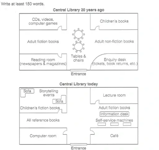
The twenty-year-old and present layout of a public library is shown in the diagram.
Overall, the library now accommodates more facilities compared to the past. A dedicated computer room has been built, and a café has been opened. The current lecture room was the children’s book section twenty years ago. The entrance and perimeter of the library have remained the same.
In the past, a reading room for newspapers and magazines was to the left of the entrance, while on the right, there was an enquiry desk for tickets, book returns, and other services. Both of these rooms have now been replaced with a computer room and a café, respectively. The center of the library is now empty, where tables and chairs were placed twenty years ago.
In the center-left of the library, the reference books section has replaced the adult fiction books, which have now been relocated to the right of the library information desk. Additionally, self-service machines have been installed. The back right-hand corner, which previously housed children’s books, has been converted into a lecture room. The room in the back left-hand corner, which once contained CDs, videos, and computer games, has been expanded to include sofas and children’s fiction books and is now used for storytelling events.
Test - 4
The graph shows the average monthly change in the prices of three metals during 2014.
Summarise the information by selecting and reporting the main features, and make comparisons where relevant.
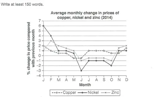
The average monthly alterations in the prices of copper, nickel, and zinc in 2014 are shown in a line graph. The data is given in percentages.
Overall, the monthly price changes were more dramatic for nickel throughout the year. In July, August, and September, the percentage change in the prices of all three metals remained unchanged from the previous months. Copper exhibited the least variation in price changes over the year.
The percentage change in the price of nickel was 6 percent in January 2014 as compared to previous month, which dropped sharply to just 1 percent in March and remained unchanged in April. After April, the price change continued to decline, and plummeted to -3 percent in June. It then increased to -1 percent in July and remained stable until September. After decreasing to -2 percent in October, in November and December, the price change turned positive at 1 percent.
In January 2014, the percentage change in price compared to the previous month was 2% for copper and 1% for zinc. The price change for zinc increased to 3%, while for copper, it dropped to 1% in February. After a gradual fall in subsequent months, in June, zinc experienced a -1% price change, which fluctuated between 0% and -1% over the next three months before rising to 2% in December. Copper’s price change fell below 0% in May and June but returned to 1% during the stable months of July to September. In December, the price change for copper ranged between 1% and 2% after remaining below 1 percent in October and November.